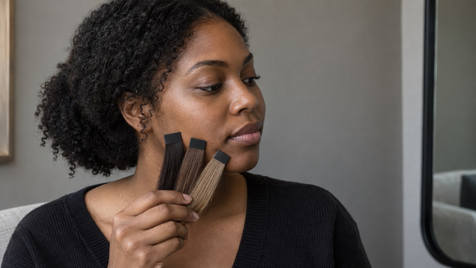
Understanding hair depth levels: the 1 to 10 scale
Hair depth describes how light or dark a color is. It is separate from tone, which describes the warm, cool, or neutral character within that depth. A level 6 golden dark blonde and a level 6 ash dark blonde can feel very different in temperature while carrying similar visual weight.
Many professional systems arrange depth from level 1 black through level 10 lightest blonde, although brand names and numbering can vary. Wella’s hair-color glossary uses that 1-to-10 range and defines level as lightness or darkness. Treat the chart as a shared vocabulary for comparison, not a promise that every brand or colorist will label your starting hair identically.
| Levels | Common depth family | Useful screen question |
|---|---|---|
| 1–3 | Black to dark brown | Does the deeper frame feel intentional, or does it overpower the detail in your brows and eyes? |
| 4–5 | Medium to light brown | Does this depth keep definition while giving the face and hair separate visual space? |
| 6–7 | Dark to medium blonde | Does the lighter frame soften contrast without making the preview look flat? |
| 8–10 | Light to lightest blonde | Are roots, shadows, and strand variation still believable, or has the app replaced them with one pale block? |
To estimate your current level, compare the darkest area of clean, dry hair near the roots with a professional swatch book in neutral light. Ignore isolated highlights and faded ends. A photograph can shift depth, so confirm the estimate with a colorist before using it to plan lift or a formula. The photo-analysis methodology guide explains which inputs remain unknown on screen.
How lighter and darker shades change visible contrast
A dark preview does not literally change your skin, but it places a heavy frame around the face. Level 2 or 3 hair may make existing facial shadows, brows, and eye outlines seem more pronounced because the contrast is stronger. If the filter also turns the hair into a single dark shape, that artificial block can exaggerate the effect.
A very light preview can do the opposite. When the hair, skin, brows, and background move toward similar values, the image may lose separation and look visually faded. That “washed out” impression is a contrast effect, not proof that light hair is incompatible with a particular skin depth. Root depth, lowlights, brow definition, clothing, and the room’s light can change the reading.
- Save one neutral-toned option near your current level as the control.
- Compare one version two or three levels deeper and one version two or three levels lighter, without changing temperature.
- Review all three at the same size and brightness. Look for preserved facial detail, believable hair dimension, and the amount of contrast you actually want.
Keep skin depth and undertone separate. Skin depth is how light or deep the skin appears; undertone is its subtler warm, cool, or neutral direction. One phone photo cannot establish undertone reliably, especially with makeup, surface redness, tanning, or colored light.
Matching your natural contrast level: high vs. medium vs. low contrast complexions
Contrast is the visible difference in depth among your hair, skin, eyes, and brows. It is not a quality ranking, and you do not have to preserve your natural contrast. It simply predicts whether a new depth will feel like a subtle continuation or a deliberately graphic change.
High contrast
If your hair or brows are much deeper than your skin, a level 3 or 4 may continue that strong frame. A level 7 can soften it noticeably. Compare whether the lighter option still gives your eyes and brows enough context, or whether a shadow root would better preserve the structure you enjoy.
Medium contrast
With a moderate difference among features, you may have room to move in either direction without one element dominating. Test a nearby brunette and dark-blonde level at the same temperature. The more useful distinction may be maintenance and root visibility rather than visual harmony alone.
Low contrast
When hair, skin, brows, and eyes sit in a closer value range, a very deep shade creates a more graphic outline. That can be exactly the intention. Compare soft black with dark brown if you want intensity, or retain a mid-depth root and dimensional pieces if you want a quieter transition.
Review the finalists in grayscale as a quick depth check, then return to color before deciding. Grayscale can expose value differences, but it cannot evaluate warmth, coolness, fading, or the process required to reach the shade. Use the color decision guide to narrow the visual direction, then turn the selected preview into a practical colorist consultation brief.
A level describes depth; a tone describes reflect
Two shades can share a depth but look different because one reads golden and the other ashy. Compare a warm brown, a neutral brown, and a cool brown at a similar level before comparing lighter and darker options.
Shade codes vary by brand. Bring a visual reference and words such as “medium brown with a muted cool reflect” rather than treating a number as a formula. For examples across different skin depths, see the skin-tone comparison guide.
Frequently asked questions
How do I determine what hair level I currently have?
Compare the least faded root area with a professional level chart in neutral daylight. Focus on overall depth rather than scattered highlights, gray strands, or porous ends. Because cameras and previous color can distort the estimate, ask a colorist to confirm the level before planning a major lightening or darkening service.
Why does black hair make some people look washed out?
Black creates the strongest possible dark frame, so skin, brows, and eyes may appear lighter by comparison. A flat digital overlay can intensify that impression by removing natural highlights. Compare black with soft black and level 3 dark brown under the same conditions before deciding how much contrast you prefer.
Can fair skin wear level 3 dark brown hair?
Yes. Skin depth does not prohibit a hair level. Level 3 will usually create strong contrast on fair skin, so compare neutral, warm, and cool versions without assuming the photo proves your undertone. If you want a softer transition, test level 4 or a dimensional level 3 with a less solid root.