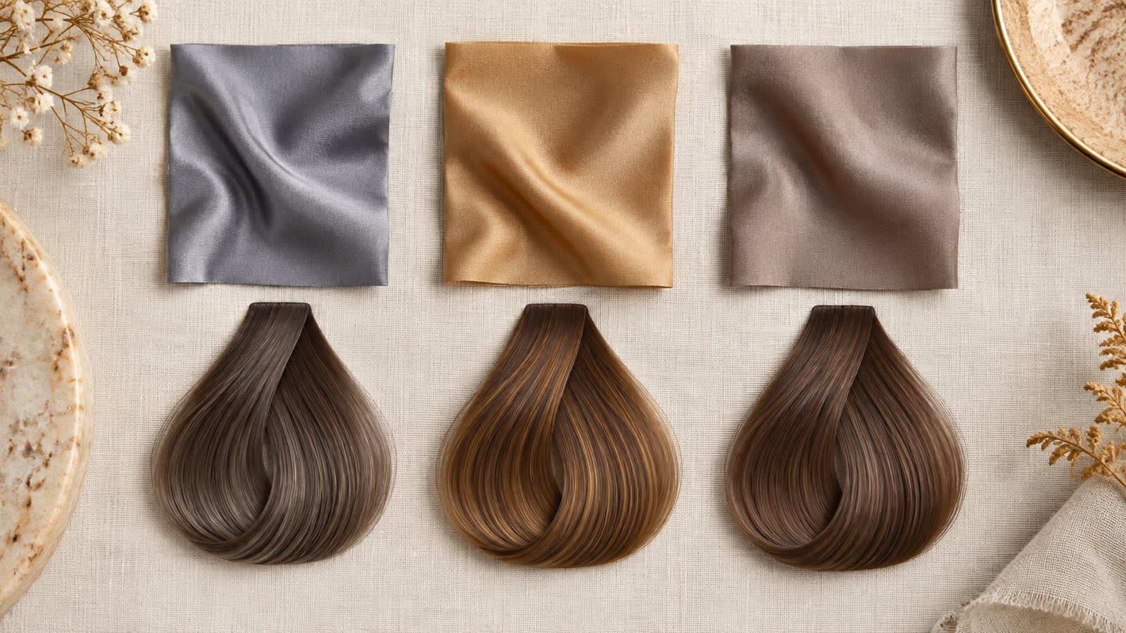
Understanding tone temperature: gold, ash, and neutral reflects
Hair depth and hair temperature are separate decisions. Depth tells you how light or dark the color reads. Temperature describes the visible reflect: gold and copper read warm; ash, pearl, or violet-led tones read cool; neutral and beige directions sit closer to the middle. A brunette, blonde, or red family can contain more than one temperature.
Salon shade codes are useful shorthand, but they are not universal. In the Wella numbering system, for example, /0 indicates natural, /1 ash, and /3 gold. Another color line may arrange or name tones differently. Bring both a visual reference and descriptive words instead of relying on a number alone.
Compare cleanly: hold depth steady. Put a level-6 golden brown, level-6 ash brown, and level-6 neutral brown side by side. If one option is also much lighter, you will not know whether you prefer its temperature or its brightness.
Why ash can look dull on low-contrast warm coloring—and vice versa
Ash tones reduce visible warmth. On a composition where skin, eyes, brows, and natural hair share soft golden or reddish notes, a very matte ash can remove too much of that connection and make the hair read flat. The same ash may look crisp when the surrounding coloring already contains cooler, clearer relationships.
The reverse can happen with strong gold or copper. On low-contrast cool or neutral coloring, a saturated warm reflect may become the first thing you see, while a muted beige or cool-neutral option keeps the composition quieter. This is an effect, not a prohibition. You may want the hair to be the most vivid element.
Surface redness can also mislead a photo comparison. It is not the same as warm undertone, and camera processing may exaggerate it. Compare several images in neutral light and notice the full composition rather than trying to match one patch of skin.
The tri-tone harmony matrix
Skin depth does not determine one correct hair temperature. Use the matrix to choose three controlled previews at a depth that is realistic for your starting point. “Olive” describes a green-gray cast that can appear across more than one skin depth and may coexist with warm, cool, or neutral undertone readings.
| Visible skin depth / context | Warm reflect | Cool reflect | Neutral reflect | What to observe |
|---|---|---|---|---|
| Fair or light | Soft gold, strawberry-beige, warm light brown | Pearl beige, soft ash blonde, cool light brown | Wheat blonde, neutral beige, balanced light brown | Does the hair stay connected to the brows and eyes, or create the sharper contrast you want? |
| Light-to-medium olive | Muted honey, caramel brown, restrained copper-brown | Mushroom brown, taupe brunette, muted ash bronde | Beige brown, neutral bronde, soft mocha | Does green-gray cast look clearer in one direction, and is that harmony or contrast your preference? |
| Medium | Golden brown, chestnut, warm espresso | Cool chocolate, ash brown, blue-black at higher contrast | Neutral chocolate, balanced espresso, beige brunette | Is temperature or depth dominating the comparison? Keep both controlled before deciding. |
| Deep | Warm black, mahogany-brown, deep copper accents | Blue-black, cool espresso, violet-brown | Natural black, neutral espresso, balanced deep brown | Do you want the reflect to appear mainly in daylight or remain obvious indoors? |
A neutral direction is not necessarily colorless. Beige, mocha, or balanced brown can contain both warm and cool components. Neutral is especially useful when you like your current depth but want the finished color to feel less golden or less smoky.
For a concrete muted cool-neutral example, review the Soft Summer hair color palette. Use it as a temperature case study, not as proof that you belong to a seasonal category.
How to choose between harmony and contrast
- Choose a hair depth you enjoy and that a colorist considers realistic for your current base.
- Compare warm, cool, and neutral versions at that same depth in one photo and one screen setting.
- Notice whether the hair connects quietly with the eyes and brows or becomes the strongest color statement.
- Keep the harmonious option and the contrasting option if both appeal to you. Preference can outweigh a category label.
- Ask how each direction will fade. Cool tones may reveal warmth over time; vivid warm tones may need tonal refreshes to stay intentional.
A hair color decision guide can make the visual choice easier. It cannot tell you the formula, underlying pigment, porosity, or safe lift required to reach it.
Frequently asked questions
How do I know if warm or cool hair color suits me better?
Compare both at the same depth in neutral light. Look at the relationship among hair, skin, eyes, and brows, then decide whether you prefer a more connected or more contrasting result. Do not rely on veins, jewelry, or one phone photo as a definitive test.
Can neutral skin wear both gold and ash hair colors?
Yes. Neutral coloring often supports more than one temperature, but the intensity still matters. A soft gold and a muted ash may both work as wearable directions while a very orange gold or dense gray ash creates a stronger statement. Hair history and upkeep may make one easier to maintain.